
YOU’RE READY TO BUILD
Now that you have your 3 Style Guides, let’s talk about what to do with them.
I’m going to use my own platform as an example - I suggest following along!
In my brainstorm, I wrote a lot about books and films that inspire me in my work. I love gothic fiction and A24 films. I also draw a lot on nature in my photography work, and I am a lifetime lover of folklore and mythology. My work reflects all of this, but I want to communicate that to my clients so that the right people find me! My guide words were:
Cinematic, Organic, Ethereal
What were your guide words again?
As a starting point, we need to transform your style guides into 3 things:
A color palette, a trademark icon, banner, or logo, and a tone of voice.
COLOR
Color is a powerful way to communicate the spirit of your brand to your followers. And it’s not just about picking a “theme color.” For example, look at how I can communicate different brand values using just orange.

Playful, Optimistic:
Creamsicle orange with harmonious pinks and whites

Bold, Striking:
Bright tangerine with stark, high contrast

Sweet, Soft, Delicate:
Light, Bright Apricot, with Natural Neutrals
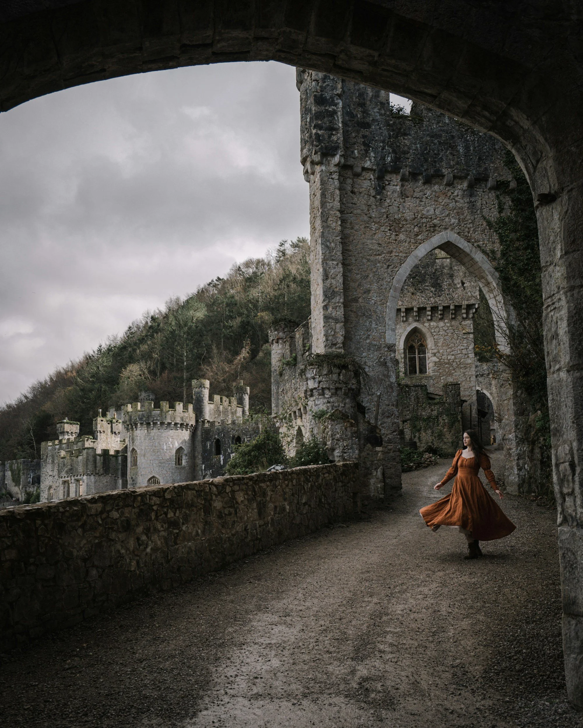
Dramatic, Moody:
Burnt orange with deep charcoals and cool neutrals